Combining Float and Positioning: A Complete Page Layout
The Layout Designing tutorial taught you float for building
side-by-side columns. The CSS Positioning tutorial taught you
position for placing things precisely and keeping elements pinned in place. Real pages
almost always need both at once. This tutorial builds one complete, realistic page —
a sticky toolbar with a logo and a horizontal menu (with a notification badge), a
vertical sidebar menu, a floated three-column body, a floated four-column footer, and a
"back to top" button — combining every technique from both tutorials into one project.
Prerequisites: Layout Designing and CSS Positioning.
In This Tutorial
- Build a sticky toolbar combining
position: stickywith a floated logo and a floated horizontal menu - Add a small notification badge to a menu item using
position: relativeon the parent andposition: absoluteon the badge - Build a three-column body containing a vertical sidebar menu, using
floatfor the columns themselves - Understand exactly why a vertical menu needs no float, while a horizontal one does
- Build a four-column footer using
float, and fix a real text-overflow bug along the way - Add a
position: fixed"back to top" button that stays anchored to the browser window regardless of scrolling - See the complete, combined page and a summary of which technique does what
Part 1: The Toolbar — Float for Layout, Position for Behavior
Start with the header. The logo and the menu sit side by side — that's a job for
float, exactly like the navigation menu in Layout Designing:
<header id="toolbar">
    <div id="logo">MH<span>Studio</span></div>
    <ul id="main-menu">
        <li><a href="#">Home</a></li>
        <li><a href="#">Services</a></li>
        <li class="has-badge"><a href="#">Messages</a><span class="badge">3</span></li>
        <li><a href="#">Contact</a></li>
    </ul>
</header>
#toolbar {
  position: sticky;
  top: 0;
  z-index: 100;
  background-color: #2b2b7a;
  color: white;
  padding: 12px 30px;
  overflow: hidden; /* clearfix: contains the floated logo and menu */
}

#logo {
  float: left;
  font-size: 1.4rem;
  font-weight: bold;
  line-height: 32px;
}
#logo span { font-weight: normal; opacity: 0.8; margin-left: 4px; }

#main-menu {
  float: right;
  list-style: none;
  margin: 0;
  padding: 0;
}
#main-menu li {
  float: left;
  margin-left: 24px;
  position: relative; /* positioning context for the badge below */
}
#main-menu a { color: white; text-decoration: none; font-weight: bold; line-height: 32px; }
#main-menu a:hover { text-decoration: underline; }

.badge {
  position: absolute;
  top: -8px;
  right: -14px;
  background-color: #ff8a3d;
  color: white;
  font-size: 0.7rem;
  font-weight: bold;
  padding: 2px 6px;
  border-radius: 999px;
}

Three separate things are happening here, and it's worth naming each one:
float: left/float: righton#logoand#main-menuplaces them side by side — this is pure layout, exactly like Layout Designing's navigation example.position: stickyon#toolbaritself keeps the whole header pinned to the top of the browser window once you scroll past it, instead of scrolling away with the rest of the page. (As always withsticky, a still screenshot can only show it at rest — you need to scroll a real page to see it stick.)position: relativeon each#main-menu li, combined withposition: absoluteon.badge, is the classic "badge in the corner" pattern: thelibecomes the positioning anchor, and the badge places itself relative to that specific list item — not the whole page — using small negative offsets to hang slightly off its top-right corner.
Why the li needs position: relative
An absolutely positioned element always positions itself relative to its nearest
positioned ancestor — the closest parent that has any position value other than
the default static. Without position: relative on the li, the badge would jump
all the way up to position itself relative to #toolbar (the next positioned
ancestor up the tree) instead of sitting neatly on its own menu item.
Part 2: A Vertical Menu — Why It Needs No Float
The dashboard sidebar needs a vertical list of links, stacked one under another:
<ul class="vertical-menu">
<li><a href="#">Overview</a></li>
<li><a href="#">Projects</a></li>
<li><a href="#">Messages</a></li>
<li><a href="#">Settings</a></li>
<li><a href="#">Billing</a></li>
</ul>
.vertical-menu { list-style: none; margin: 0; padding: 0; }
.vertical-menu li { margin-bottom: 4px; }
.vertical-menu a {
display: block;
padding: 8px 10px;
color: #2b2b7a;
text-decoration: none;
border-radius: 4px;
}
.vertical-menu a:hover { background-color: #e2e2f0; }
Notice there is no float anywhere in this CSS. That's the whole point: <li> is a
block-level element, and block-level elements already stack vertically by default —
that's just normal document flow. The horizontal menu in Part 1 needed float precisely
because it had to fight against that default stacking behavior; a vertical menu is
simply what happens if you do nothing extra at all. display: block on the <a> here
isn't for stacking — it's so each link's clickable/hoverable area fills the full width
of its <li>, not just the width of the link text.
Part 3: The Three-Column Body
Now place that vertical menu inside the left column of a three-column layout — a sidebar, a main content area, and a secondary widgets column — using the same float-and-width technique from Layout Designing:
<div id="page-body">
<nav id="sidebar-menu" class="column">
<h2>Dashboard</h2>
<ul class="vertical-menu">
<li><a href="#">Overview</a></li>
<li><a href="#">Projects</a></li>
<li><a href="#">Messages</a></li>
<li><a href="#">Settings</a></li>
<li><a href="#">Billing</a></li>
</ul>
</nav>
<main id="main-content" class="column">
<h1>Welcome Back, Muhammad</h1>
<p>This layout combines the Layout Designing and CSS Positioning tutorials into
one real page: a sticky toolbar, a horizontal menu, a vertical sidebar menu, a
floated three-column body, and a four-column footer.</p>
<p>Scroll down in a real browser to see the toolbar stay pinned to the top of the
page - that is <code>position: sticky</code> at work.</p>
</main>
<aside id="widgets" class="column">
<div class="widget">
<h3>Quick Stats</h3>
<p>12 new messages</p>
</div>
<div class="widget">
<h3>About</h3>
<p>A demo project combining float-based columns with CSS positioning.</p>
</div>
</aside>
</div>
#page-body {
overflow: hidden; /* clearfix: contains the three floated columns */
max-width: 1100px;
margin: 0 auto;
}
.column { float: left; padding: 24px; }
#sidebar-menu { width: 22%; background-color: #f4f4f8; }
#main-content { width: 56%; }
#widgets { width: 22%; background-color: #f4f4f8; }
.widget {
background: white;
border: 1px solid #ddd;
padding: 12px;
margin-bottom: 16px;
border-radius: 6px;
}
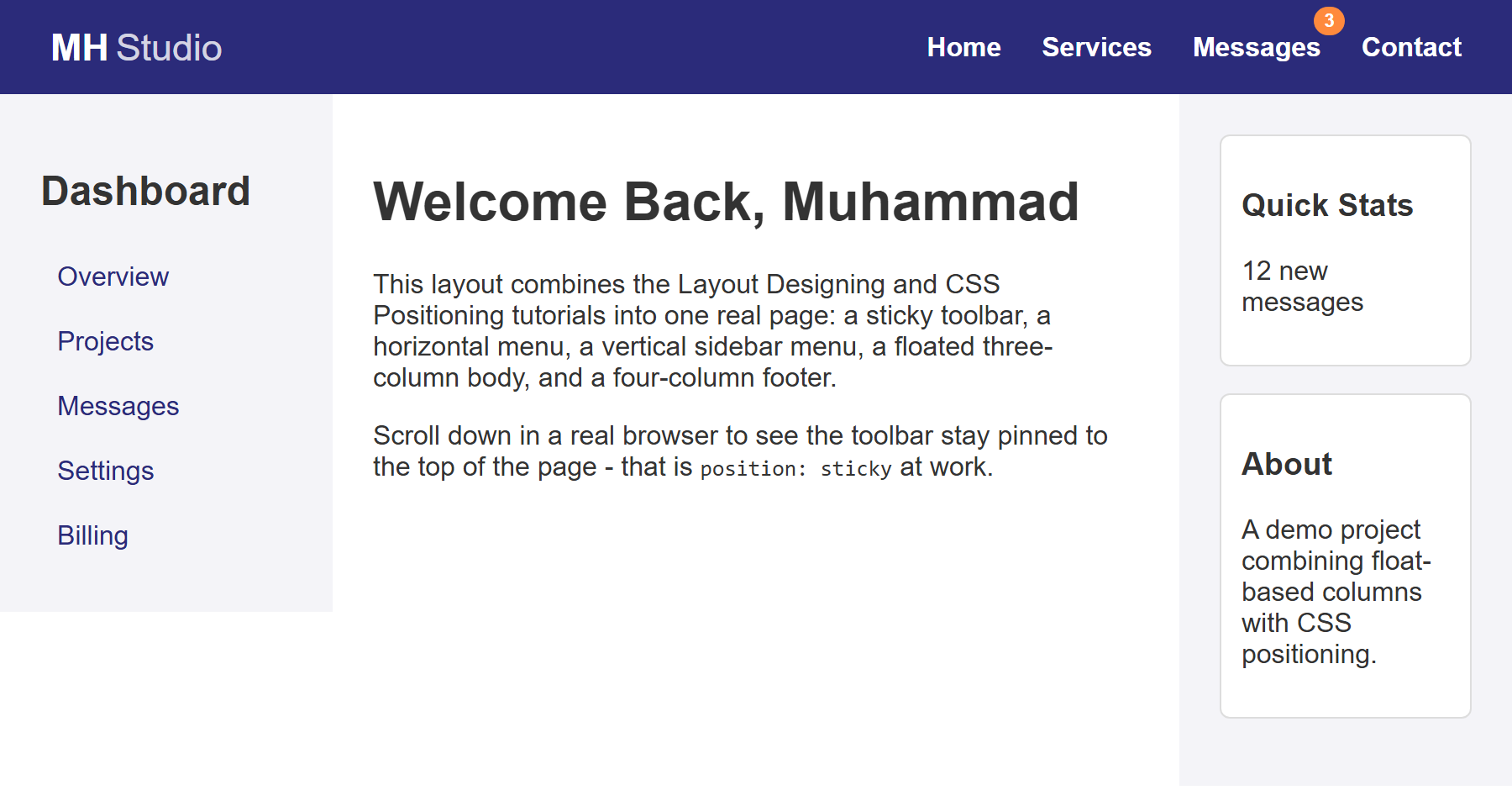
This is the same overflow: hidden clearfix from Layout Designing, applied for exactly
the same reason: #sidebar-menu, #main-content, and #widgets are all floated, so
without it #page-body would collapse to zero height.
Part 4: The Four-Column Footer
The footer uses the identical technique as the three-column body — four float: left
columns, each 25% wide, inside a container with overflow: hidden:
<footer id="site-footer">
<div class="footer-columns">
<div class="footer-col">
<h4>MH Studio</h4>
<p>Building simple, honest web layouts, one tutorial at a time.</p>
</div>
<div class="footer-col">
<h4>Quick Links</h4>
<ul>
<li><a href="#">Home</a></li>
<li><a href="#">Services</a></li>
<li><a href="#">Contact</a></li>
</ul>
</div>
<div class="footer-col">
<h4>Contact</h4>
<p>muhammad.hassan@example.com</p>
<p>+92 300 1234567</p>
</div>
<div class="footer-col">
<h4>Follow Us</h4>
<ul>
<li><a href="#">Twitter</a></li>
<li><a href="#">LinkedIn</a></li>
<li><a href="#">GitHub</a></li>
</ul>
</div>
</div>
<p class="copyright">© 2026 Muhammad Hassan. Built with HTML & CSS.</p>
</footer>
#site-footer { background-color: #1f1f52; color: #ccc; padding: 40px 30px 20px; }
.footer-columns { overflow: hidden; max-width: 1100px; margin: 0 auto; }
.footer-col {
float: left;
width: 25%;
padding: 0 15px;
overflow-wrap: break-word;
}
.footer-col h4 { color: white; margin-top: 0; }
.footer-col ul { list-style: none; margin: 0; padding: 0; }
.footer-col li { margin-bottom: 6px; }
.footer-col a { color: #ccc; text-decoration: none; }
.footer-col a:hover { text-decoration: underline; }
.copyright {
clear: both;
text-align: center;
padding-top: 20px;
margin-top: 20px;
border-top: 1px solid #3a3a75;
font-size: 0.85rem;
}

A real bug worth knowing about: overflow-wrap: break-word
Without it, a long unbreakable string like muhammad.hassan@example.com will not
wrap inside its 25%-wide column at all — it overflows straight into the next
column and visually overlaps it, producing garbled-looking text. This is a genuinely
common real-world bug with fixed-width columns and long words/URLs/emails.
overflow-wrap: break-word tells the browser it's allowed to break a word mid-way,
onto a new line, rather than let it overflow its container. Try removing that one
line and reloading to see the overlap for yourself.
Part 5: A Fixed "Back to Top" Button
Finally, add a button that always stays in the same corner of the browser window, no matter how far down the page you've scrolled:
#back-to-top {
position: fixed;
bottom: 24px;
right: 24px;
background-color: #ff8a3d;
color: white;
padding: 10px 16px;
border-radius: 999px;
text-decoration: none;
font-weight: bold;
box-shadow: 0 4px 10px rgba(0,0,0,0.2);
}
position: fixed positions an element relative to the browser window (viewport)
itself, completely ignoring the page's normal document flow and completely unaffected by
scrolling — that's the key difference from sticky, which only stays put within its
own parent once a scroll threshold is reached. A "back to top" button, a chat bubble, or
a cookie-consent bar are all classic real-world uses of position: fixed. Here, the
href="#toolbar" also makes it a genuinely working link: clicking it jumps straight back
to the element with id="toolbar", at the very top of the page.
Part 6: Putting It All Together
Here is the complete page — every piece from Parts 1 through 5 combined into one
index.html and style.css:
<!DOCTYPE html>
<html lang="en">
<head>
<meta charset="UTF-8">
<meta name="viewport" content="width=device-width, initial-scale=1.0">
<title>Muhammad Hassan's Web Studio</title>
<link rel="stylesheet" href="style.css">
</head>
<body>
<header id="toolbar">
<div id="logo">MH<span>Studio</span></div>
<ul id="main-menu">
<li><a href="#">Home</a></li>
<li><a href="#">Services</a></li>
<li class="has-badge"><a href="#">Messages</a><span class="badge">3</span></li>
<li><a href="#">Contact</a></li>
</ul>
</header>
<div id="page-body">
<nav id="sidebar-menu" class="column">
<h2>Dashboard</h2>
<ul class="vertical-menu">
<li><a href="#">Overview</a></li>
<li><a href="#">Projects</a></li>
<li><a href="#">Messages</a></li>
<li><a href="#">Settings</a></li>
<li><a href="#">Billing</a></li>
</ul>
</nav>
<main id="main-content" class="column">
<h1>Welcome Back, Muhammad</h1>
<p>This layout combines the Layout Designing and CSS Positioning tutorials into
one real page: a sticky toolbar, a horizontal menu, a vertical sidebar menu, a
floated three-column body, and a four-column footer.</p>
<p>Scroll down in a real browser to see the toolbar stay pinned to the top of the
page - that is <code>position: sticky</code> at work.</p>
</main>
<aside id="widgets" class="column">
<div class="widget">
<h3>Quick Stats</h3>
<p>12 new messages</p>
</div>
<div class="widget">
<h3>About</h3>
<p>A demo project combining float-based columns with CSS positioning.</p>
</div>
</aside>
</div>
<footer id="site-footer">
<div class="footer-columns">
<div class="footer-col">
<h4>MH Studio</h4>
<p>Building simple, honest web layouts, one tutorial at a time.</p>
</div>
<div class="footer-col">
<h4>Quick Links</h4>
<ul>
<li><a href="#">Home</a></li>
<li><a href="#">Services</a></li>
<li><a href="#">Contact</a></li>
</ul>
</div>
<div class="footer-col">
<h4>Contact</h4>
<p>muhammad.hassan@example.com</p>
<p>+92 300 1234567</p>
</div>
<div class="footer-col">
<h4>Follow Us</h4>
<ul>
<li><a href="#">Twitter</a></li>
<li><a href="#">LinkedIn</a></li>
<li><a href="#">GitHub</a></li>
</ul>
</div>
</div>
<p class="copyright">© 2026 Muhammad Hassan. Built with HTML & CSS.</p>
</footer>
<a href="#toolbar" id="back-to-top">Top</a>
</body>
</html>
* { box-sizing: border-box; }
body { margin: 0; font-family: Arial, Helvetica, sans-serif; color: #333; }
/* ---- Toolbar / Header ---- */
#toolbar {
position: sticky;
top: 0;
z-index: 100;
background-color: #2b2b7a;
color: white;
padding: 12px 30px;
overflow: hidden;
}
#logo {
float: left;
font-size: 1.4rem;
font-weight: bold;
line-height: 32px;
}
#logo span { font-weight: normal; opacity: 0.8; margin-left: 4px; }
#main-menu {
float: right;
list-style: none;
margin: 0;
padding: 0;
}
#main-menu li {
float: left;
margin-left: 24px;
position: relative;
}
#main-menu a { color: white; text-decoration: none; font-weight: bold; line-height: 32px; }
#main-menu a:hover { text-decoration: underline; }
.badge {
position: absolute;
top: -8px;
right: -14px;
background-color: #ff8a3d;
color: white;
font-size: 0.7rem;
font-weight: bold;
padding: 2px 6px;
border-radius: 999px;
}
/* ---- 3-Column Body ---- */
#page-body {
overflow: hidden;
max-width: 1100px;
margin: 0 auto;
}
.column { float: left; padding: 24px; }
#sidebar-menu { width: 22%; background-color: #f4f4f8; }
#main-content { width: 56%; }
#widgets { width: 22%; background-color: #f4f4f8; }
.vertical-menu { list-style: none; margin: 0; padding: 0; }
.vertical-menu li { margin-bottom: 4px; }
.vertical-menu a {
  display: block;
  padding: 8px 10px;
  color: #2b2b7a;
  text-decoration: none;
  border-radius: 4px;
}
.vertical-menu a:hover { background-color: #e2e2f0; }
.widget {
background: white;
border: 1px solid #ddd;
padding: 12px;
margin-bottom: 16px;
border-radius: 6px;
}
/* ---- 4-Column Footer ---- */
#site-footer { background-color: #1f1f52; color: #ccc; padding: 40px 30px 20px; }
.footer-columns { overflow: hidden; max-width: 1100px; margin: 0 auto; }
.footer-col {
  float: left;
  width: 25%;
  padding: 0 15px;
  overflow-wrap: break-word;
}
.footer-col h4 { color: white; margin-top: 0; }
.footer-col ul { list-style: none; margin: 0; padding: 0; }
.footer-col li { margin-bottom: 6px; }
.footer-col a { color: #ccc; text-decoration: none; }
.footer-col a:hover { text-decoration: underline; }

.copyright {
  clear: both;
  text-align: center;
  padding-top: 20px;
  margin-top: 20px;
  border-top: 1px solid #3a3a75;
  font-size: 0.85rem;
}
/* ---- Back to Top (fixed position) ---- */
#back-to-top {
  position: fixed;
  bottom: 24px;
  right: 24px;
  background-color: #ff8a3d;
  color: white;
  padding: 10px 16px;
  border-radius: 999px;
  text-decoration: none;
  font-weight: bold;
  box-shadow: 0 4px 10px rgba(0,0,0,0.2);
}
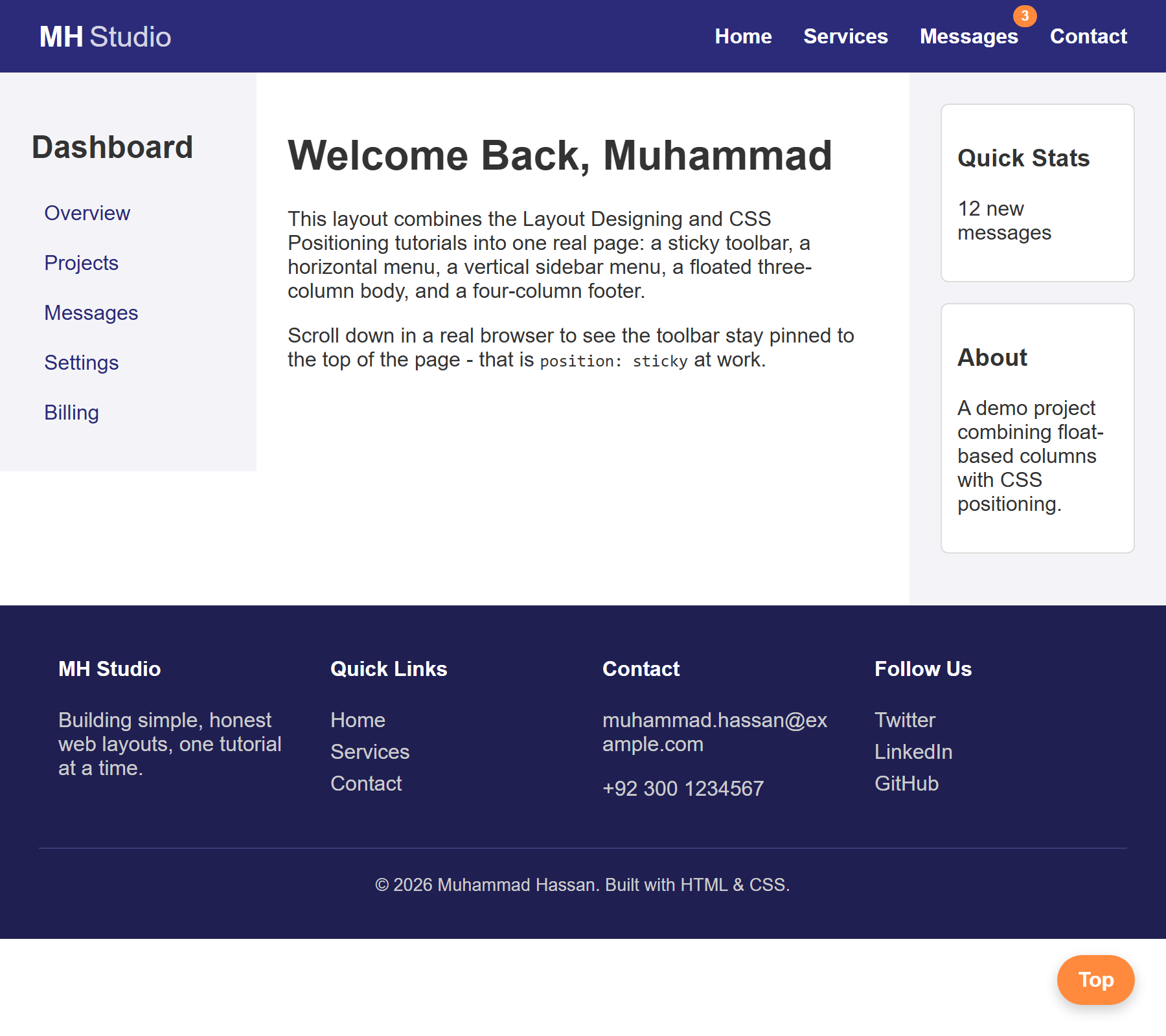
Here is the finished page, as it looks when you first load it (before scrolling):
Which Technique Does What
| Technique | Used where in this page | Why |
|---|---|---|
float: left / float: right |
Logo + menu in the toolbar; the three body columns; the four footer columns | Placing block-level elements side by side instead of stacking |
overflow: hidden (clearfix) |
#toolbar, #page-body, .footer-columns |
Making a container properly enclose its floated children |
| (no float at all) | The vertical sidebar menu | Vertical stacking is simply the default behavior of block-level elements |
position: sticky |
#toolbar |
Keeps the header pinned to the top once you scroll past it |
position: relative + position: absolute |
Each #main-menu li + .badge |
Placing a small badge precisely on its own menu item |
position: fixed |
#back-to-top |
Keeping a button anchored to the browser window, ignoring scroll and page flow entirely |
Try It Yourself
- Add a fifth column to the footer (for example, "Newsletter" with a short sentence),
and adjust every
.footer-colwidth so five columns still fit without wrapping. - Add a second badge — a green "New" badge on the "Services" menu item — reusing the
.badgeclass. - Give the currently "active" sidebar link (for example, "Overview") a distinct background color using a new class, so a user can tell which page they're on.
- Temporarily delete
overflow: hidden;from#page-bodyand reload — watch the footer jump up and overlap the three columns, exactly like the collapsed-parent bug from Layout Designing, then put it back. - Move
#back-to-topto the bottom-left instead of the bottom-right by changingright: 24px;toleft: 24px;.
Key Takeaways
- Real pages combine
float(for side-by-side layout) andposition(for pinning, badges, and overlays) constantly — they solve different problems and are not alternatives to each other. - A horizontal menu needs
float(or Flexbox) to override the default vertical stacking of<li>elements; a vertical menu needs nothing extra, because vertical stacking is already the default. position: stickykeeps an element pinned within its own parent once scrolled to;position: fixedpins an element to the browser window itself, ignoring scroll and document flow completely.- A
position: relativeparent combined with aposition: absolutechild is the standard way to place a small badge, icon, or label precisely on a specific element. overflow-wrap: break-wordprevents long, unbreakable text (like an email address) from overflowing a fixed-width column into its neighbor — a genuinely common real-world bug.