Lecture 10: Responsive Design and Framework Fundamentals (Bootstrap or Tailwind)
Your site needs to look good on a giant desktop monitor, a laptop, a tablet held sideways, and a phone screen barely 350 pixels wide — often all at once, since you cannot control what device a visitor uses. This lecture covers responsive design, the set of techniques for building one site that adapts to any screen, and introduces the two major styles of CSS framework — Bootstrap and Tailwind CSS — that make responsive design faster in practice.
In This Lecture
- Understand mobile-first design, the viewport meta tag, and fluid units (
%,rem,vw/vh) - Use media queries and breakpoints — combining conditions with
and/,/not, and features beyond width likeorientation,prefers-color-scheme, andprint— and make images respond to screen size - Compare component-based frameworks (Bootstrap) with utility-first frameworks (Tailwind)
- Learn Bootstrap's grid system in depth — auto-layout columns, nesting, offsetting, reordering, and alignment — plus its components and utilities
- Learn Tailwind's utility-class structure, its configuration file, and dark mode
- Extend either framework with your own custom classes and components
- Understand CSS preprocessors — Sass (SCSS), and LESS — and why they exist
- Use Sass variables, nesting, mixins, and partials, and use them to customize Bootstrap's own source before it compiles
Mobile-First Design, the Viewport Meta Tag, and Fluid Units
Mobile-first design
Mobile-first design means you write your base CSS for small screens first, then use media queries to add styling for larger screens as space becomes available. This is the opposite of the older approach — "desktop-first" — where you designed for a big screen and then tried to cram everything onto a phone afterward.
Mobile-first is preferred today for two reasons: mobile traffic makes up the majority of web visits worldwide, and it is far easier to progressively add complexity (extra columns, a sidebar) as screen space grows than to strip complexity away.
flowchart LR
    A["Base styles\n(no media query)\nsmall phone screens"] --> B["@media (min-width: 576px)\nlarge phones"]
    B --> C["@media (min-width: 768px)\ntablets"]
    C --> D["@media (min-width: 992px)\nlaptops"]
    D --> E["@media (min-width: 1200px)\ndesktops"]
The viewport meta tag
By default, mobile browsers assume a web page was built for a desktop and try to fit that
full desktop-width page onto the small screen by zooming out — which makes everything tiny
and forces the user to pinch-zoom just to read text. The viewport meta tag, placed in
your HTML <head>, disables that behavior and tells the browser to render the page at the
device's actual width.
width=device-width— use the actual pixel width of the device, not a fake desktop width.initial-scale=1.0— start at 100% zoom (no zooming in or out by default).
Never forget this tag
Without the viewport meta tag, none of your media queries will work correctly on a real phone — the browser will still be pretending it has a much wider screen. This single line should be in every HTML page you build from here on.
Fluid units
A fluid unit is a measurement that scales relative to something else, instead of being
a fixed, absolute size like pixels (px). Using fluid units is a big part of what makes a
layout genuinely responsive rather than just "resized."
| Unit | Relative to | Example use |
|---|---|---|
% |
The size of the parent element | width: 50%; — half of the parent's width |
rem |
The root (<html>) element's font size, usually 16px by default |
font-size: 1.5rem; — scales with the user's font-size preference |
em |
The current element's own font size | Rarely used for layout; more common inside typography |
vw |
1% of the viewport's (browser window's) width | width: 100vw; — always exactly the full screen width |
vh |
1% of the viewport's height | height: 100vh; — always exactly the full screen height |
html {
  font-size: 16px; /* 1rem = 16px, by default */
}

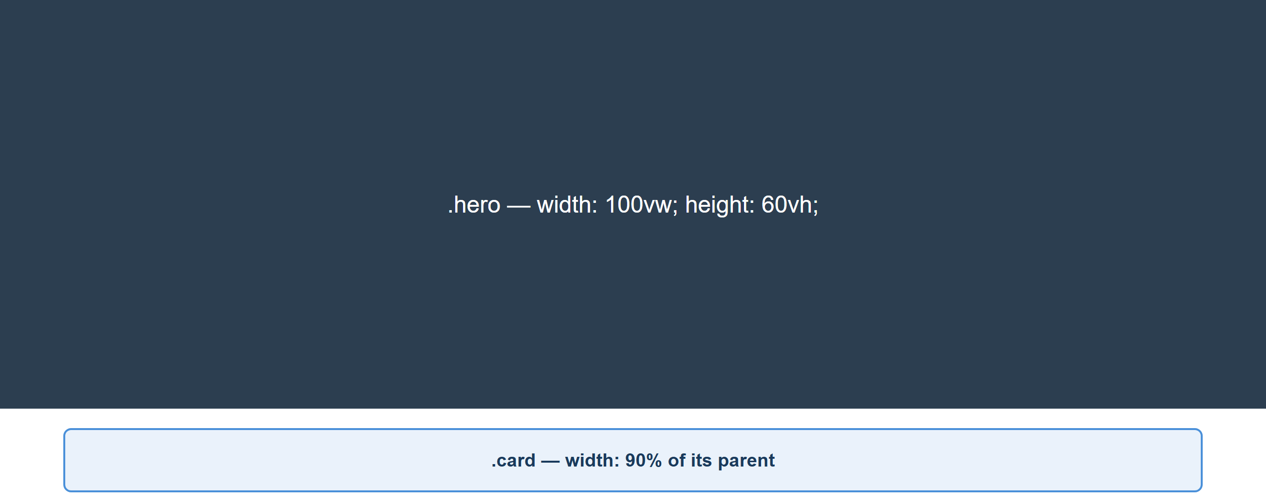
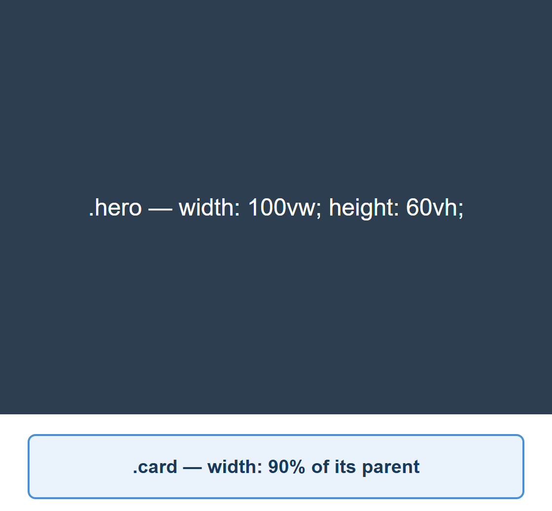
.hero {
  width: 100vw;   /* always fills the full screen width */
  height: 60vh;   /* always 60% of the visible screen height */
  padding: 2rem;  /* scales if the user changes their base font size */
}

.card {
  width: 90%; /* always 90% of its parent's width, whatever that is */
}
The same page rendered at a wide desktop width and at a narrow mobile width shows why fluid
units matter: the dark .hero block always spans the full browser width and 60% of the
browser height, and the light .card box always spans 90% of its own container, in both
cases:
Why rem instead of px for text?
Some users increase their browser's default font size for accessibility reasons (poor
eyesight, for example). Text sized in px ignores that setting completely. Text sized in
rem scales along with it, which is why most professional style guides recommend rem
for font sizes.
Media Queries, Breakpoints, and Responsive Images
Media queries and breakpoints
You already met the @media rule in Lecture 8. A breakpoint is simply the specific
screen width at which your layout changes to accommodate more (or less) space — it is the
value you put inside a min-width or max-width media query.
/* mobile-first base styles: apply to every screen size */
.container {
  display: flex;
  flex-direction: column;
}

/* tablet breakpoint and up */
@media (min-width: 768px) {
  .container {
    flex-direction: row;
  }
}

/* desktop breakpoint and up */
@media (min-width: 1200px) {
  .container {
    max-width: 1140px;
    margin: 0 auto;
  }
}
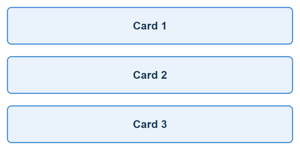
Applying this exact CSS to a .container holding three cards shows the collapse in action:
a wide screen lays the cards out in a row, and a narrow screen — below the 768px breakpoint —
stacks them into a single column instead:

There is no single "correct" set of breakpoints — they should match your actual content, not a fixed rulebook. That said, most frameworks (including Bootstrap, which you will see below) converge on a similar rough set of common device widths: around 576px (large phones), 768px (tablets), 992px (laptops), and 1200px+ (desktops).
Media Query Syntax: and, comma, and not
The general shape of a media query is:
@media [not] media-type and (media-feature: value) and (media-feature: value) {
  /* CSS rules to apply */
}
media-typeis optional and is almost alwaysscreen(or left out entirely, which means "all types"). You will also meet theprinttype below.andcombines multiple conditions — every condition joined byandmust be true for the rule to apply.,(a comma) works like or — the media query matches if any one of the comma-separated conditions is true.notinverts an entire media query's result. If you usenot, you must also name a media type.
Combining min-width and max-width: targeting a range
and lets you target a specific band of screen sizes — for example, "tablets only, not
phones and not desktops":
/* Applies only between 768px and 1199px (inclusive) — a "tablet-only" range */
@media (min-width: 768px) and (max-width: 1199px) {
  .sidebar {
    display: none; /* hide the sidebar just on this one range of screens */
  }
}
Combining conditions with , (OR)
/* Applies if EITHER the screen is 480px or narrower, OR the device is in portrait mode */
@media (max-width: 480px), (orientation: portrait) {
  .hero {
    font-size: 1.2rem;
  }
}
Other media features you will run into
Width and height are the most common media features, but @media can test several other
things about the device and the user's preferences:
/* orientation: is the viewport wider than it is tall, or the opposite? */
@media (orientation: landscape) {
  .gallery {
    grid-template-columns: repeat(4, 1fr);
  }
}

/* prefers-color-scheme: respects the user's OS/browser dark mode setting */
@media (prefers-color-scheme: dark) {
  body {
    background: #111;
    color: #eee;
  }
}

/* print: a media TYPE, not a feature — only applies when the page is printed */
@media print {
  nav, footer, .no-print {
    display: none; /* don't waste paper printing navigation or footers */
  }
}
| Media feature / type | Matches |
|---|---|
min-width / max-width |
Viewport at least / at most this wide |
min-height / max-height |
Viewport at least / at most this tall |
orientation: portrait / landscape |
Viewport taller-than-wide, or wider-than-tall |
prefers-color-scheme: light / dark |
The user's OS/browser light or dark mode setting |
print (a media type, not a feature) |
The page is being printed or print-previewed |
hover / pointer |
Whether the input device can hover, and how precise it is (mouse vs. touch) |
None of orientation, prefers-color-scheme, or print can be demonstrated in a static
screenshot — each depends on something about the device or user setting, not just window
width — but they use exactly the same @media (feature: value) { ... } syntax you have
already seen for min-width/max-width, so nothing new to learn beyond the feature names
themselves.
Practice these live on W3Schools
W3Schools has several free, editable "Try it Yourself" pages built around exactly this topic — open one, resize the results pane (or the whole browser window), and watch the breakpoint fire in real time:
- CSS Media Queries — the full
@mediasyntax, includingand,,,not, andorientation - CSS Media Queries — Examples — several live, editable breakpoint demos (background colors, column counts) you can resize and rerun instantly
- Responsive Web Design — Media Queries — the same mobile-first breakpoint pattern used earlier in this lecture
- Responsive Web Design — Grid View — a realistic multi-column layout built entirely from breakpoints
- How To — Create a Mobile Navigation Menu — a complete, realistic navbar that collapses to a hamburger icon below a breakpoint
- CSS
@mediaRule reference — the full list of media types and features, for whenever you need one this lecture didn't cover
Responsive images
An image with a fixed width in pixels will overflow a small screen's container and force
horizontal scrolling — one of the most common beginner mistakes. The fix is simple:
Here the same 800×400px image sits inside a container fixed at 60% of the page width — the image scales down to fit the container at both a wide and a narrow page width, instead of overflowing it:
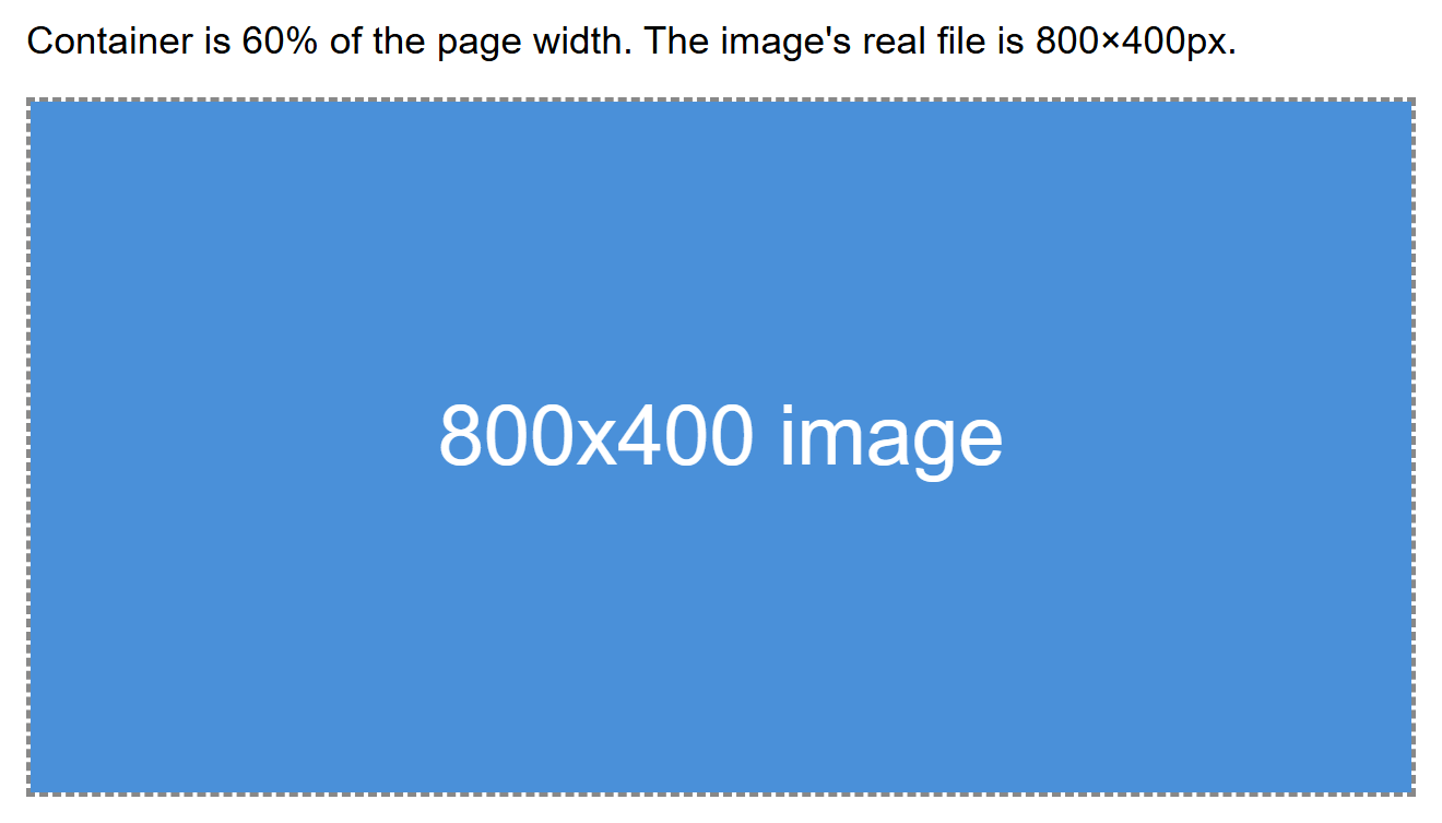
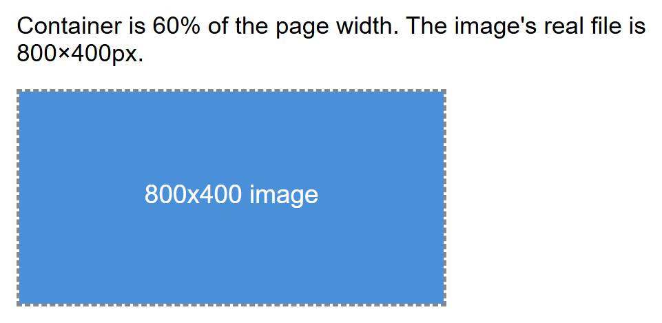
max-width: 100% means the image never grows wider than its parent container, while
height: auto keeps its aspect ratio correct as it shrinks. This one rule is often applied
globally near the top of a stylesheet.
For more advanced cases — like serving a smaller image file to phones so they are not
forced to download a huge desktop-sized photo — HTML provides the srcset attribute, which
lets the browser choose the best-fitting image file from a list you provide:
<img
  src="photo-small.jpg"
  srcset="photo-small.jpg 480w, photo-medium.jpg 800w, photo-large.jpg 1200w"
  sizes="(max-width: 600px) 480px, (max-width: 1000px) 800px, 1200px"
  alt="A scenic mountain view">
The browser reads sizes to figure out roughly how large the image will display at the
current screen width, then downloads whichever file in srcset best matches — saving
bandwidth on smaller devices.
Framework Philosophies: Component-Based vs. Utility-First
Writing every layout and every button style completely from scratch, on every project, is slow. A CSS framework is a pre-written library of CSS (and sometimes JavaScript) that gives you ready-made building blocks so you can move faster. The two dominant philosophies today are represented by Bootstrap and Tailwind CSS.
- Component-based frameworks (Bootstrap is the classic example) ship pre-styled,
ready-to-use components — a finished button, a finished navbar, a finished card — each
identified by a class name like
.btnor.card. You mostly assemble your page out of these ready-made pieces. - Utility-first frameworks (Tailwind CSS is the classic example) ship hundreds of tiny,
single-purpose utility classes — one class does one job, like
flex,p-4(padding), ortext-center. You compose these small classes directly in your HTML to build your own custom-looking components from scratch.
| Bootstrap (component-based) | Tailwind (utility-first) | |
|---|---|---|
| What you get out of the box | Fully-styled components (buttons, cards, navbars) | Small utility classes you combine yourself |
| Visual result by default | Sites can look similar unless customized | Nothing looks "designed" until you style it — no default look to fight against |
| How much custom CSS you write | Less, at first — but overriding built-in styles can fight the framework | Very little separate CSS — most styling lives in your HTML as classes |
| Learning curve | Fast to get a decent-looking page up quickly | Takes longer at first — you must learn many class names |
| Good for | Prototypes, admin panels, projects that need to ship fast with minimal design work | Projects wanting a highly custom, unique look without leaving CSS entirely behind |
Neither one is objectively 'better'
Both are extremely popular in industry, and the CSC336 lab will let your instructor pick either. The important thing is understanding why they feel so different to use: one hands you finished components, the other hands you building blocks.
Bootstrap: Grid System, Components, and Utilities
Bootstrap is a CSS (and optional JavaScript) framework you include via a <link> tag (or
install as a package). It gives you a responsive grid system, a large library of
pre-styled components, and a set of small utility classes for common tweaks.
<link href="https://cdn.jsdelivr.net/npm/bootstrap@5.3.3/dist/css/bootstrap.min.css" rel="stylesheet">
The Bootstrap grid system
Bootstrap's grid is built on Flexbox internally, organized into 12 columns. You wrap your
content in a .container, then a .row, then divide that row into .col-* classes whose
numbers add up to 12 for a full row.
<div class="container">
  <div class="row">
    <div class="col-md-8">Main content (8 of 12 columns on medium screens+)</div>
    <div class="col-md-4">Sidebar (4 of 12 columns on medium screens+)</div>
  </div>
</div>
Rendered with real Bootstrap CSS loaded from the CDN link above, the two columns sit side by
side at their assigned 8/12 and 4/12 widths on a wide screen, then stack full-width on a
narrow screen below the md breakpoint — Bootstrap's built-in mobile-first behavior:

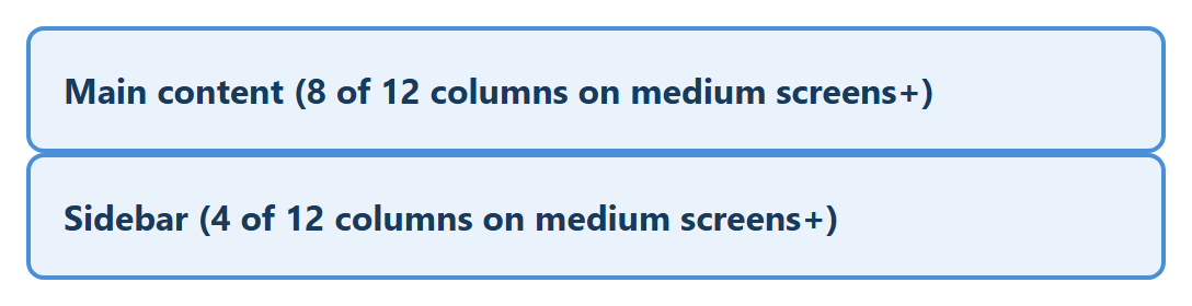
The md in col-md-8 is a breakpoint prefix — it means "use 8 columns' width starting
at the medium breakpoint and up." Below that breakpoint, columns you don't size explicitly
stack full-width automatically, which is Bootstrap's built-in mobile-first behavior.
| Prefix | Approx. screen width |
|---|---|
| (none) | All sizes (mobile-first default) |
sm |
≥576px |
md |
≥768px |
lg |
≥992px |
xl |
≥1200px |
More Grid Techniques
Sizing every column explicitly (col-md-8, col-md-4) is only the start. The grid has
several other tools for real layouts.
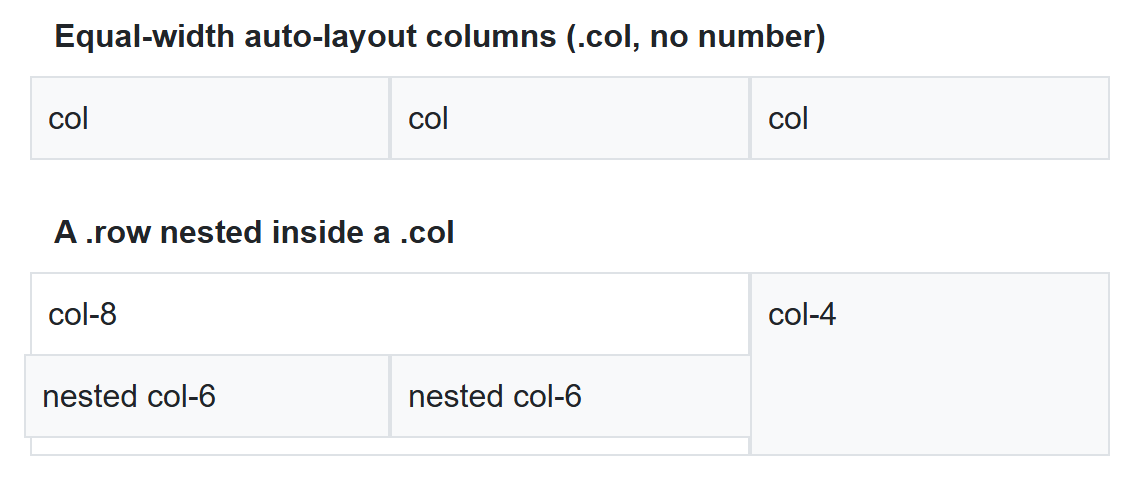
Equal-width, auto-layout columns. Leave the number off .col entirely and Bootstrap
divides the row evenly among however many columns you add — useful when you don't want to
do the arithmetic yourself:
<div class="row">
  <div class="col">col</div>
  <div class="col">col</div>
  <div class="col">col</div>
</div>
Nesting. A .row can be placed inside a .col to build a sub-grid — the nested row's
own columns are sized out of 12, independent of the parent column's actual width:
<div class="row">
  <div class="col-8">
    col-8
    <div class="row">
      <div class="col-6">nested col-6</div>
      <div class="col-6">nested col-6</div>
    </div>
  </div>
  <div class="col-4">col-4</div>
</div>
Rendered together, three equal auto-layout columns on top, and an 8/4 split with a nested 2-column row inside the 8-wide column on the bottom:
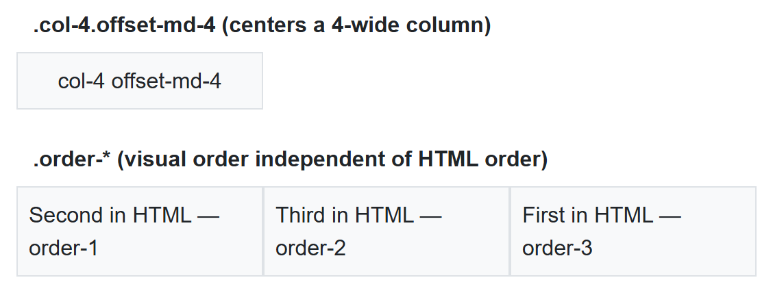
Offsetting. .offset-{breakpoint}-{n} pushes a column to the right by n empty
columns' worth of space, without needing an invisible spacer column:
col-4 offset-md-4 leaves 4 empty columns, then places a 4-wide column, then leaves the
remaining 4 empty — centering it in the row.
Reordering. .order-{n} (0 through 5) changes the visual order of columns without
touching their order in the HTML — handy when source order (for accessibility or SEO)
should differ from visual order:
<div class="row">
  <div class="order-3">First in HTML — order-3</div>
  <div class="order-1">Second in HTML — order-1</div>
  <div class="order-2">Third in HTML — order-2</div>
</div>
Rendered together — the centered offset column on top, and the three reordered columns below, visually rearranged even though the middle one is written second in the HTML:
| Class pattern | Effect |
|---|---|
.col (no number) |
Auto-layout: shares available width equally with sibling .cols |
.col-{n} |
Exactly n of 12 columns wide, at all screen sizes |
.col-{breakpoint}-{n} |
n columns wide from that breakpoint up (mobile-first) |
.offset-{breakpoint}-{n} |
Pushes the column right by n empty columns |
.order-{n} |
Visual display order (0–5), independent of HTML source order |
.row-cols-{n} |
Shorthand: every direct child column becomes 12/n wide |
.g-{n} / .gx-{n} / .gy-{n} |
Gutter (gap) size between columns — all / horizontal / vertical |
.justify-content-* / .align-items-* on .row |
Flexbox alignment of columns along/across the row (same values as Lecture 9's Flexbox) |
It's Flexbox underneath
Every one of these classes is a thin wrapper around the Flexbox properties from
Lecture 9 — .row is display: flex, .col is a flex item, and .justify-content-*
on a .row is exactly the justify-content property you already know. Knowing Flexbox
is what makes Bootstrap's grid classes predictable instead of memorized.
Bootstrap components
Components are ready-made pieces of UI — you just add the right classes to your HTML.
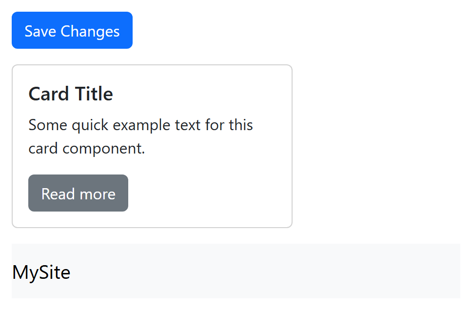
<button class="btn btn-primary">Save Changes</button>

<div class="card" style="width: 18rem;">
  <div class="card-body">
    <h5 class="card-title">Card Title</h5>
    <p class="card-text">Some quick example text for this card component.</p>
    <a href="#" class="btn btn-secondary">Read more</a>
  </div>
</div>

<nav class="navbar navbar-expand-lg navbar-light bg-light">
  <a class="navbar-brand" href="#">MySite</a>
</nav>
Rendered with Bootstrap's CSS applied, these three lines of HTML alone produce a fully styled button, card, and navbar — none of the visual polish comes from custom CSS:
Bootstrap utilities
Alongside full components, Bootstrap also includes small single-purpose utility classes for common adjustments like spacing, text alignment, and color — similar in spirit to Tailwind's approach, just with a smaller set of classes.
<div class="d-flex justify-content-between p-3 mb-4 text-center">
  <!-- d-flex: display: flex
       justify-content-between: justify-content: space-between
       p-3: padding on all sides
       mb-4: margin-bottom
       text-center: centers text -->
</div>
Rendered (with a dashed border added just to make the flex container's edges visible), the
"Left item" and "Right item" spans sit at opposite ends of the row, spaced apart by
justify-content-between:

Tailwind CSS: Utility-Class Structure
Tailwind takes the opposite approach: instead of shipping finished components, it gives you a very large set of small utility classes, and you build your own look by combining them directly in your markup.
<button class="bg-blue-600 hover:bg-blue-700 text-white font-semibold px-4 py-2 rounded-lg shadow">
  Save Changes
</button>
Rendered with the Tailwind Play CDN loaded, that single class list produces a fully styled button with no separate CSS file at all:
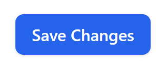
Reading that one class list top to bottom already tells you exactly what the button looks like, without switching to a separate CSS file:
| Class | Meaning |
|---|---|
bg-blue-600 |
Background color: a specific shade of blue |
hover:bg-blue-700 |
On hover, switch to a darker shade of blue |
text-white |
White text color |
font-semibold |
Semi-bold font weight |
px-4 py-2 |
Horizontal padding level 4, vertical padding level 2 |
rounded-lg |
Large border-radius |
shadow |
A preset box-shadow |
Tailwind is also responsive by default, using breakpoint prefixes on any utility class —
the exact same mobile-first idea as Bootstrap's col-md-8, just spelled differently:
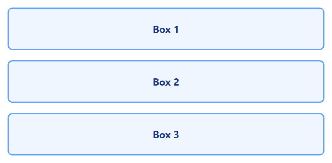
<div class="flex flex-col md:flex-row">
  <!-- flex-col by default (stacked, mobile-first)
       md:flex-row switches to a row once the screen is "md" width or larger -->
</div>

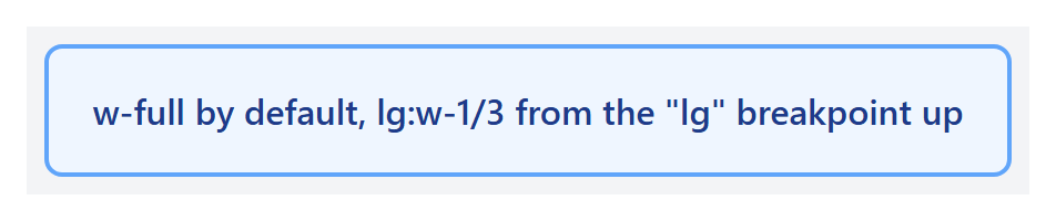
<div class="w-full lg:w-1/3">
  <!-- full width by default, one-third width from the "lg" breakpoint up -->
</div>
The flex flex-col md:flex-row example, rendered with three boxes inside it, stacks in a
column on a narrow screen and switches to a row once the screen reaches the md breakpoint:

The w-full lg:w-1/3 example, rendered inside a gray wrapper so the surrounding space is
visible, fills nearly the entire wrapper on a narrow screen but shrinks to about a third of
it once the screen reaches the lg breakpoint:

Reading Tailwind classes
Most Tailwind class names follow a property-value pattern (text-center, p-4,
bg-red-500), and a breakpoint prefix like md: or lg: before a class means "only
apply this class from that screen width and up" — mirroring the same mobile-first logic
you learned earlier in this lecture.
More Utility Categories
Tailwind's utilities cover nearly every CSS property. A few categories you will reach for constantly, beyond spacing and color:
| Category | Example classes | Equivalent CSS |
|---|---|---|
| Flexbox | flex, justify-center, items-center, gap-4 |
display: flex; justify-content: center; align-items: center; gap: 1rem; |
| Grid | grid, grid-cols-3, col-span-2 |
display: grid; grid-template-columns: repeat(3, 1fr); grid-column: span 2; |
| Sizing | w-1/2, h-screen, max-w-md |
width: 50%; height: 100vh; max-width: 28rem; |
| Borders | border, border-2, rounded-full |
border-width: 1px; border-width: 2px; border-radius: 9999px; |
| Typography | text-lg, font-bold, truncate |
font-size: 1.125rem; font-weight: 700; text-overflow: ellipsis; |
| State variants | hover:, focus:, active:, disabled: |
:hover, :focus, :active, :disabled — prefix any utility with these |
Tailwind's spacing scale (used by p-*, m-*, gap-*, w-*, and more) is a consistent
numeric scale, not arbitrary pixel values: 1 = 0.25rem (4px), 2 = 0.5rem (8px), 4 =
1rem (16px), and so on — the same "pick a small set of values and only use those" spacing
discipline from Lecture 6, just built into the framework. Colors follow a similar scale per
hue, from 50 (near-white) to 900 (near-black), e.g. blue-100 through blue-900.
Customizing Tailwind: the Configuration File
The default color palette and spacing scale are only a starting point. A real project
configures Tailwind with a tailwind.config.js file, extending (not replacing) the
defaults with your own design tokens:
module.exports = {
  theme: {
    extend: {
      colors: {
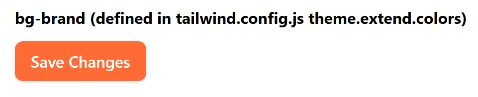
        brand: '#ff6b35', // now usable as bg-brand, text-brand, border-brand, etc.
      },
    },
  },
};
Once configured, brand behaves exactly like any built-in color — it works with every
color utility and every state-variant prefix, because it's now a real value in Tailwind's
own color scale, not a one-off custom class:
<button class="bg-brand hover:bg-orange-700 text-white font-semibold px-4 py-2 rounded-lg">
  Save Changes
</button>
theme.extend adds new values without discarding Tailwind's defaults; using theme
directly (without extend) replaces the entire default scale for that key instead — almost
always what you don't want, since it also removes every built-in color or spacing value.
Dark Mode
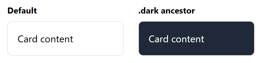
Tailwind supports a dark: variant that applies only when dark mode is active. With
darkMode: 'class' in the config, dark mode activates for any element inside a dark
class — commonly placed on <html> and toggled with a few lines of JavaScript that read
the user's stored preference or prefers-color-scheme:
module.exports = {
  darkMode: 'class', // or 'media' to follow the OS setting automatically, no toggle needed
};
Rendered twice — the same markup, once with no dark ancestor and once inside a container
carrying class="dark" — shows the dark: utilities taking over automatically:
The @apply Directive
When the same combination of utilities repeats across many elements, Tailwind's @apply
directive lets you fold them into one custom class inside a real CSS file, without giving
up the utility values themselves:
.btn-primary {
  @apply bg-blue-600 hover:bg-blue-700 text-white font-semibold px-4 py-2 rounded-lg shadow;
}
This produces the exact same rendered button as writing out all six utility classes by
hand — @apply is purely a way to name a repeated combination, not a different way of
styling. Reach for it when the same long class list shows up on many elements; for a
one-off element, the plain utility classes in the HTML are usually clearer.
Using Custom Classes and Adding Components
Neither framework expects you to only ever use their built-in classes — real projects almost always mix in your own custom CSS.
Bootstrap components are ordinary HTML with ordinary classes, so you can add your own class alongside Bootstrap's and override just the parts you want to change:
Rendered together, Bootstrap's .btn.btn-primary styling (color, padding, rounded
corners) and the custom .my-cta-button rule (uppercase, letter-spacing) both apply to
the same button:

Because .my-cta-button is your own class, its rule can add new styles on top of
whatever .btn.btn-primary already sets, as long as it's loaded after Bootstrap's CSS
(or is specific enough to win).
You can also build a brand-new "component" simply by combining Bootstrap's grid and utility classes into a reusable HTML snippet you copy wherever you need it — Bootstrap does not require any special registration step for this.
Because Tailwind components are just a combination of utility classes, "creating a component" usually means saving that exact combination somewhere reusable — for example, as a snippet, a template partial, or (in component-based tools like React) a single reusable component function:
<!-- reuse this exact combination everywhere you need a primary button -->
<button class="bg-blue-600 hover:bg-blue-700 text-white font-semibold px-4 py-2 rounded-lg shadow">
  Get Started
</button>
For styles that don't fit neatly into existing utilities, you can still write plain custom CSS and combine it with Tailwind's utilities on the same element:
Rendered together, Tailwind's text-blue-600 font-bold utilities and the custom
.brand-underline CSS rule both apply to the same span:

In both frameworks, the same rule applies: use the framework for the 80% of common styling it already solves well, and drop into plain custom CSS for the remaining 20% that makes your project look like your project instead of a generic template.
CSS Preprocessors: Sass, SCSS, and LESS
Plain CSS lacks things every real programming language has: variables, reusable blocks of code, and a way to split one large file into smaller, organized pieces. A CSS preprocessor is a separate language that adds those features on top of CSS — you write in the preprocessor's language, then compile it into plain CSS that a browser can actually read. Sass and LESS are the two most widely used preprocessors, and Sass in particular is what Bootstrap itself is written in.
flowchart LR
    A["your-styles.scss\n(Sass source you write)"] -->|"compile\n(sass CLI / build tool)"| B["your-styles.css\n(plain CSS)"]
    B --> C["Browser\n(links styles.css normally)"]
The browser never sees Sass or LESS directly — it only ever loads the compiled, plain .css
output. This is exactly the same "source vs. what the browser runs" split you already know
from writing modern JavaScript (Lecture 11 onward) that gets compiled/bundled before it
ships.
Sass has two syntaxes
Sass actually offers two ways to write it: the original indented syntax (.sass
files, no braces or semicolons, indentation-based like Python) and SCSS (.scss
files, which look like ordinary CSS with braces and semicolons, just with extra
features added). SCSS is by far the more common choice today — including in Bootstrap's
own source — because any valid CSS file is also valid SCSS, so adopting it requires no
rewriting. Every example below uses SCSS.
Why Not Just Use CSS Custom Properties?
Lecture 8 already introduced CSS custom properties (--main-color, read with
var(--main-color)) — real runtime variables the browser understands natively. Sass
variables look similar but work completely differently:
Sass variables ($name) |
CSS custom properties (--name) |
|
|---|---|---|
| Resolved | At compile time — replaced with a literal value before the browser ever sees it | At runtime, in the browser itself |
| Can change after page load (JavaScript, media query) | No — it's already a fixed value in the compiled CSS | Yes — this is their main advantage |
| Needs a build step | Yes — a .scss file must be compiled |
No — works in a plain <style> tag |
| Useful for | Configuring a whole framework's source before it compiles (see Bootstrap below) | Theming/dark-mode switches that change live in the browser |
They solve different problems and are often used together: Sass variables configure how a stylesheet compiles, while custom properties let already-compiled CSS change in the browser afterward.
Sass Fundamentals
Variables store a reusable value under a $name:
$primary-color: #6c5ce7;
$spacing: 16px;

.card {
  padding: $spacing;
  border: 1px solid $primary-color;
}
Nesting lets you write a child selector's rules physically inside its parent's block,
instead of repeating the parent selector every time — including &, which refers back to
the parent selector itself (essential for states like :hover):
.card {
  padding: $spacing;
  border: 1px solid $primary-color;

  .title {
    color: $primary-color;
    font-weight: bold;
  }

  &:hover {
    box-shadow: 0 4px 10px rgba(0, 0, 0, 0.2);
  }
}
Mixins are reusable blocks of declarations — closer to a function than a variable —
defined once with @mixin and reused anywhere with @include:
@mixin flex-center {
  display: flex;
  justify-content: center;
  align-items: center;
}

.banner {
  @include flex-center;
  height: 80px;
  background: $primary-color;
  color: white;
}
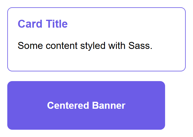
Compiling the variables, nesting, and mixin above with the Sass CLI (sass input.scss
output.css) produces ordinary CSS — .card .title { ... } written out in full, &:hover
expanded to .card:hover { ... }, and the mixin's three declarations copied directly into
.banner. Rendered in a browser, the result is indistinguishable from CSS written by hand:
Partials and @use. A real project splits Sass across many small files instead of one
giant one. A filename starting with an underscore (_variables.scss) is a partial —
Sass knows not to compile it into its own separate CSS file, only to pull it into whatever
file imports it:
@use (the modern replacement for the older @import) loads a partial's variables and
mixins under a namespace (v. above), keeping large stylesheets organized into logical
files — colors, typography, one file per component — without any of that structure leaking
into the compiled output.
Math and built-in functions. Sass supports arithmetic directly in property values, plus built-in color functions:
$base: 16px;

.container {
  padding: $base * 2;              /* 32px */
  width: calc(100% - #{$base * 2}); /* interpolate a Sass value inside calc() */
}

.button:hover {
  background: darken($primary-color, 10%); /* 10% darker than $primary-color */
}
LESS: The Same Idea, Different Syntax
LESS solves the same problems as Sass — variables, nesting, mixins — with a syntax
close enough to switch between them at a glance, but with @ instead of $ for variables
(easy to confuse with CSS's own @media/@import, one reason many teams now prefer Sass):
@primary-color: #6c5ce7;

.card {
  border: 1px solid @primary-color;

  .title {
    color: @primary-color;
  }
}

.mixin-example() {
  display: flex;
  justify-content: center;
}

.banner {
  .mixin-example();
  background: @primary-color;
}
| Feature | Sass (SCSS) | LESS |
|---|---|---|
| Variable syntax | $name |
@name |
| Mixin definition | @mixin name { ... } |
.name() { ... } |
| Mixin use | @include name; |
.name(); |
| Compiles via | sass (Dart Sass) |
lessc, or a bundler plugin |
| Used by | Bootstrap 4 and 5, most new projects | Bootstrap 3 (before it switched to Sass), older codebases |
LESS was historically compiled in the browser itself with a JavaScript file, which made it easy to try without any build tooling — modern projects compile both LESS and Sass ahead of time as part of the build process instead, for speed and reliability.
Customizing Bootstrap with Sass
Every Bootstrap component you have used so far is compiled from Sass source files that ship
inside the bootstrap package (node_modules/bootstrap/scss/) — the CDN .css file is
just one specific, pre-compiled build of that source, using Bootstrap's own default
variables. Overriding those variables before importing Bootstrap's Sass recompiles the
entire framework around your values — every component, everywhere, automatically.
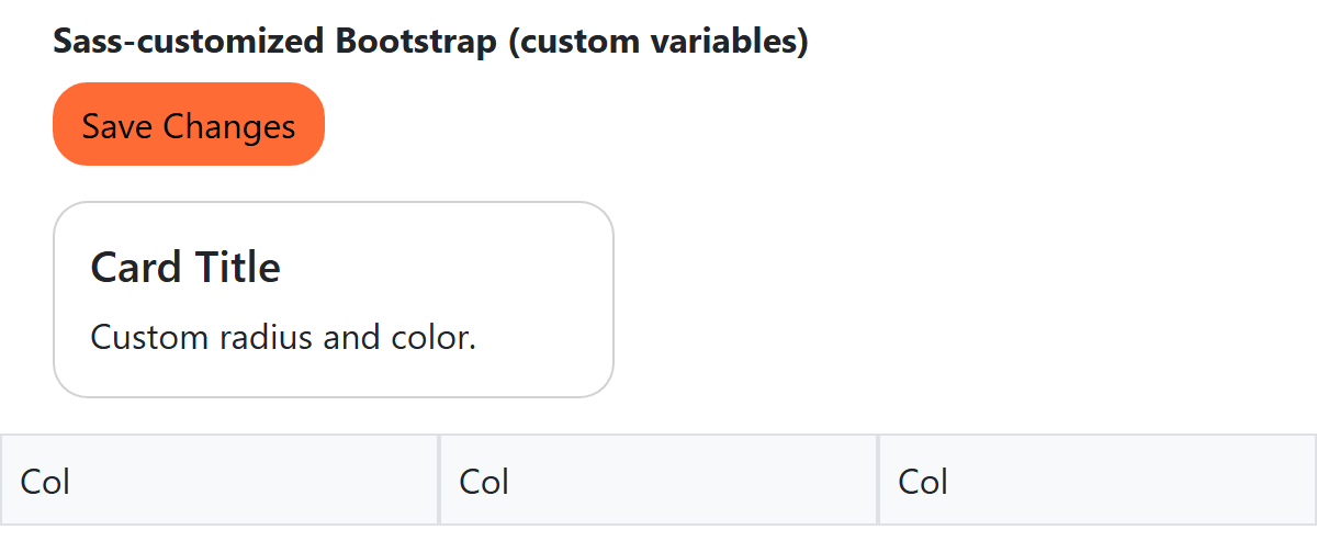
// Override Bootstrap's own variables BEFORE importing its source
$primary: #ff6b35;         // replaces Bootstrap's default blue everywhere .btn-primary etc. are used
$border-radius: 1rem;      // rounder corners on every component that uses $border-radius
$grid-gutter-width: 3rem;  // wider gaps between every .row's columns, site-wide

@import "bootstrap/scss/bootstrap";
The compiled custom.css is a genuine, complete Bootstrap build — every component that
reads $primary, $border-radius, or $grid-gutter-width picks up the new values with no
further edits anywhere. The same button, card, and grid markup, linked against the stock
Bootstrap CDN file versus this custom-compiled one:
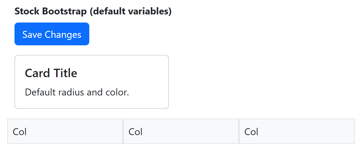
This is the real advantage of Sass over the "add a custom class after the fact" approach
from earlier in this lecture: instead of fighting Bootstrap's specificity component by
component, you configure the source once, and every current and future use of that
variable across the entire framework follows automatically. Bootstrap's own documentation
lists every variable available to override this way — colors, spacing, breakpoints, the
number of grid columns ($grid-columns: 12 by default), fonts, and more.
You don't have to compile it yourself
Tools like the Bootstrap Sass build, a bundler (Vite, webpack), or an online Sass playground can all run this same compilation step for you. The important idea to take away is what is happening — your variables are substituted into Bootstrap's own source before a single line of final CSS is generated — not memorizing a specific command line.
Try It Yourself
- Build a simple three-column "feature" section (three cards side by side on desktop,
stacking to one column on mobile) two ways: once using Bootstrap's
.container,.row, and.col-md-4classes, and once using Tailwind'sflex flex-col md:flex-rowclasses. Compare how much of the layout logic lives in your HTML versus a separate CSS file in each version. - Take a plain
<img>tag and make it fully responsive: addmax-width: 100%; height: auto;in CSS, then add the viewport meta tag to your page's<head>if it is missing, and test resizing your browser window from a wide desktop width down to a narrow phone width to confirm the image always fits its container without causing horizontal scrolling. - Write a
_variables.scsspartial defining two variables (a color and a spacing value) and a@mixinfor centering content with Flexbox.@useit from amain.scssthat styles a card with both the variables and the mixin, then compile it (with thesassCLI, or an online Sass playground) and open the resulting.cssfile to see exactly what your nesting and mixin expanded into. - Override at least two of Bootstrap's own Sass variables (for example
$primaryand$border-radius) in acustom.scssthat importsbootstrap/scss/bootstrap, compile it, and load the result instead of the Bootstrap CDN link in a test page. Confirm that every.btn-primaryon the page changed color with zero edits to your HTML.
Key Takeaways
- Mobile-first design starts with base styles for small screens and layers on complexity for
larger screens using
min-widthmedia queries. - The viewport meta tag (
<meta name="viewport" content="width=device-width, initial-scale=1.0">) is required for media queries to behave correctly on real phones. - Fluid units —
%,rem,vw,vh— scale relative to something else, instead of being fixed likepx, which is essential for layouts that truly adapt to any screen. @mediaconditions combine withand(all must be true),,(any one must be true), andnot(inverts the whole query) — and test more than just width, includingorientation,prefers-color-scheme, and theprintmedia type.max-width: 100%; height: auto;keeps images from overflowing their container;srcset/sizeslet the browser pick an appropriately-sized image file per device.- Component-based frameworks like Bootstrap give you finished, pre-styled UI pieces; utility-first frameworks like Tailwind give you small single-purpose classes you compose yourself.
- Bootstrap's 12-column, Flexbox-based grid (
.container,.row,.col-md-*) and its ready-made components (.btn,.card,.navbar) let you assemble a page quickly;.offset-*,.order-*, nesting, and auto-layout.cols cover the rest of real layouts. - Tailwind's utility classes (
flex,p-4,bg-blue-600, with breakpoint prefixes likemd:) let you build a fully custom look directly in your HTML;tailwind.config.jsextends the default theme,dark:handles dark mode, and@applynames a repeated combination as a real CSS class. - Both frameworks expect you to add your own custom CSS or reusable class combinations on top of them — frameworks solve the common 80%, not the last 20% that makes a site unique.
- CSS preprocessors (Sass/SCSS, LESS) compile to plain CSS before the browser ever sees them, adding variables, nesting, and mixins — Sass variables are resolved at compile time, unlike CSS custom properties, which live in the browser and can change at runtime.
- Bootstrap's own source is written in Sass: overriding its variables (
$primary,$border-radius,$grid-gutter-width, and more) before importing it recompiles the entire framework around your values, everywhere, with zero HTML changes.